I Hate Talking About Toggles
Somehow, here I am again rambling about SwiftUI Toggles... Last time the crux of the problem was ViewInspector's Toggle's tap() and isOn() are currently unavailable for inspection on iOS 16.
It's iOS 16+ Toggles again, but this time it's me who had to do something super greasy to make an update for a public style API while not breaking backwards compatibility for existing users.
The dark days of pre-iOS 16
@State private var isOn = false

Section("iOS 13 basic toggles") {
    Toggle("Default toggle", isOn: $isOn)
    Toggle("Always off", isOn: .constant(false))
    Toggle("Always on", isOn: .constant(true))
    Toggle("With system image", systemImage: "figure.baseball", isOn: $isOn)
}Super boring, eh? Let's spice that up a bit to see what else we can get with some builtin styles:
@State private var isOn = false

Section("iOS 13 built-in styles") {
    Toggle("Default toggle", isOn: $isOn)
    Toggle("Always off", isOn: .constant(false))
    Toggle("Always on", isOn: .constant(true))
    Toggle("With system image", systemImage: "figure.baseball", isOn: $isOn)
}.toggleStyle(.button)

Menu("Toggle in a menu") {
    Toggle("Check me", isOn: $isOn)
}There is the default .automatic which selects platform-default styles as defined
below (and it is also what created that Menu toggle):
/// The `automatic` style produces an appearance that varies by platform,
/// using the following styles in most contexts:
///
/// | Platform    | Default style                            |
/// |-------------|------------------------------------------|
/// | iOS, iPadOS | ``ToggleStyle/switch``                   |
/// | macOS       | ``ToggleStyle/checkbox``                 |
/// | tvOS        | ``ToggleStyle/switch``                   |
/// | watchOS     | ``ToggleStyle/switch``                   |
Custom styling
A VERY common use of toggles is your standard checkbox on/off. Super simple, super trivial... Where is it? Well, it's right there:
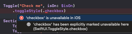
But for whatever reason (cough designers cough) it's only available on MacOS.
No problem, let's just make our own.
@State private var isOn = false

Section("Custom Togglestyle") {
    Toggle("Default toggle", isOn: $isOn)
    Toggle("Always off", isOn: .constant(false))
    Toggle("Always on", isOn: .constant(true))
    Toggle("With system image", systemImage: "figure.baseball", isOn: $isOn)
}.toggleStyle(.checkboxOnLeft)

...

struct CheckboxOnLeftToggleStyle: ToggleStyle {
    func makeBody(configuration: Configuration) -> some View {
        HStack {
            Image(systemName: configuration.isOn ? "checkmark.square" : "square")
                .resizable()
                .frame(width: 22, height: 22)
                .onTapGesture { configuration.isOn.toggle() }

            configuration.label
                .font(.subheadline)
        }.foregroundColor(configuration.isOn ? .green : .gray)
    }
}

extension ToggleStyle where Self == CheckboxOnLeftToggleStyle {
    static var checkboxOnLeft: Self {
        Self()
    }
}And, if that's not fancy enough - then you can always animate it by wrapping the configuration.isOn.toggle() with a withAnimation, though I really don't
like that. Faster is better. But whatever...
Collection of toggles
This is a common UI that I originally solved in the greasiest way possible - and have just been using that result as "good enough until Apple makes something better for this obvious workflow".
There were two ways I've done stuff like this in the past - neither of which were pretty, but
they were functional. Note, I'm showing a concrete implementation here, but in my code, I have
views that take in generics so that data types don't matter. All the where clause
elements made me think I was writing Rust...
let items = ["a", "b", "c", "d", "e"]
@State private var selections: Set<String> = []

HStack {
    ForEach(items, id: \.self) { option in
        Toggle(option.description, isOn: Binding($selections, contains: option))
    }.toggleStyle(.checkboxOnLeft)
}

...

extension Binding where Value: Equatable {
    public init<T: SetAlgebra>(_ source: Binding<T>, contains element: T.Element)
    where Value == Bool {
        self.init(
            get: { source.wrappedValue.contains(element) },
            set: { newValue in
                if newValue {
                    source.wrappedValue.insert(element)
                } else {
                    source.wrappedValue.remove(element)
                }
            }
        )
    }
}
I should point out, there is technically an easier way to do what I've shown in the example -
but this also assumes definition and usage next to each other. In my Set example, I was
originally pulling data from a database and mapping it along the way - so THIS is the easier way
to solve the exact problem I showed above, but I've not practically had to solve that exact
problem before - as it's just too trivial. It looks roughly like the code below, where you take
a binding in the ForEach and use that through the iteration. As I said, I don't
really end up using anything that looks like this in practice (with a small exception later on).
ForEach($someCollection, id: \.self) { $someItem in
    Toggle(someItem.description, isOn: $someItem)
}
Hierarchy of toggles
Ahh, the prototypical use of checkbox toggles... I assume there is a better way to do this - but this way is perfectly adequate, and I don't care to think more about it. I won't claim this is efficient though.
Note: Imagine there were more of these parent/children relationships, and they were also lodged in DisclosureGroups or something - which is a standard way of making category selectors on websites.
Also note: I'd typically use a dictionary or a custom struct for this - but here I'm just trying to show the concept with the least amount of code. Please use a tree-view centric data structure in practice.
let parent = "AB"
let children = ["A", "B"]
@State private var selections: Set<String> = []

Section("Hierarchy of Toggles") {
    VStack {
        Toggle(
            parent.description,
            isOn: Binding(
                get: { selections.count == children.count },
                set: { toggleAll(items: children, isSelected: $0, for: &selections) }
            )
        )
        HStack {
            ForEach(children, id: \.self) { option in
                Toggle(option.description, isOn: Binding($selections, contains: option))
            }
        }
    }.toggleStyle(.checkboxOnLeft)
}

...

/// Note: This doesn't need to be in-out, it could also just take in a Set, and return a new one
func toggleAll(items: [String], isSelected: Bool, for collection: inout Set<String>) {
    if isSelected {
        collection.formUnion(items)
    } else {
        collection.removeAll()
    }
}
Toggles that do more than 1 thing
I use Toggles for this, but this is the one where I definitely feel like I'm stretching. It's still technically a hierarchy, buuuuut, I feel like I'm gaming the system here. The fact that the code looks so grungy is probably a great indicator that I shouldn't really be doing this.
I'm controlling UI state with a Toggle and then also trying to represent extra data in that
Toggle. If you're ever doing something like this - please just use a separate struct/Observable containing the state you want to represent and make your life 10% easier. I
refuse to make my life easier apparently...
Okay, in reality, the place where I'm currently doing this has tech debt from years of changes, and my actual code has this sort of logic split across multiple files and data drilled through 4-5 views. Unfortunately, it's not as simple as these 20 lines of code.
After that preamble, in this example, the parent button uses the children to style itself, BUT, the children are actually independent (i.e. state flows up). The single "parent" toggle just shows them to the user. It acts more like a button, but it didn't originally act that way, so to do this without breaking changes means keeping the toggle.
For simplicity, I'm removing a ton of the levels here. This is a tree-view, so it starts from 1 parent toggle, to 5-6 child toggles, to each of those children having 5-10 more children...
let children = ["A", "B"]
@Previewable @State var shouldShowChildren = false

Section("Toggle that does too many things") {
    VStack(alignment: .center) {
        Toggle(
            "'Parent'",
            isOn: Binding(
                get: {
                    shouldShowChildren || !selections.isEmpty
                },
                set: { shouldShowChildren = $0 }
            )
        )
        if shouldShowChildren {
            HStack {
                ForEach(children, id: \.self) { option in
                    Toggle(option.description, isOn: Binding($selections, contains: option))
                }
            }
        }
    }.toggleStyle(.checkboxOnLeft)
}
Hypothetically, it could look something like this:
Oh but wait, once the parent toggle thinks it's selected, it's not really responsive anymore - so this is a no-go. I had to bind to an enum with multiple states to make this work, and I recommend against it whole-heartedly - so I won't show the gross associated code.
iOS 16 to the... rescue?
To give credit where credit is due, iOS 16 improved the Toggle collection situation a little
bit. They added dedicated initializers for Toggles of a collection. They also FINALLY added isMixed (sometimes also referred to as indeterminate) to ToggleStyles. It blew my mind they didn't have this earlier, but I guess if they didn't
even handle the collection-oriented situation, their worldview didn't allow for
non-"on"/"off" toggles.
Basic Toggle sources
struct Item {
    let name: String
    var val: Bool = false
}

@State private var sources = [
    Item(name: "Item 1"),
    Item(name: "Item 2"),
    Item(name: "Item 3"),
]

Section("iOS 16") {
    Toggle("Toggle all", sources: $sources, isOn: \.val)
    ForEach(sources, id: \.name) { item in
        Text("\(item.name) - \(item.val)")
    }
}
Now, that's boring and not really very useful. Let's make a slight change that increases the
value of this entirely. But first, let's take a detour and update the ToggleStyle with the new isMixed property:
struct CheckboxOnLeftToggleStyle: ToggleStyle {
    func makeBody(configuration: Configuration) -> some View {
        let isActive =
            if #available(iOS 16.0, *) {
                configuration.isOn || configuration.isMixed
            } else {
                configuration.isOn
            }
        return HStack {
            Image(systemName: isActive ? "checkmark.square" : "square")
                .resizable()
                .frame(width: 22, height: 22)
                .onTapGesture { configuration.isOn.toggle() }

            configuration.label
                .font(.subheadline)

        }.foregroundColor(configuration.isOn ? .green : .gray)
    }
}
A better Toggle collection
@State private var sources = [
    Item(name: "Item 1"),
    Item(name: "Item 2"),
    Item(name: "Item 3"),
]

Section("Better collection of Toggles") {
    Toggle("Parent", sources: $sources, isOn: \.val)
    HStack {
        ForEach($sources, id: \.name) { $child in
            Toggle(child.name, isOn: $child.val)
        }
    }
}.toggleStyle(.checkboxOnLeft)
Look at that, a native way to handle parent/children toggles without creating custom bindings and having them all work together.
Toggle collection with @State
One last thing that's interesting here... The signature of the initializer I'm using is actually:
init<C>(
    _ titleKey: LocalizedStringKey,
    sources: C,
    isOn: KeyPath<C.Element, Binding<Bool>>
) where C : RandomAccessCollection
The way I've used it above is to bind to a @State holding an array of items.
However, I could flip that on it's head and instead pass in an array of @States.
@State private var source1 = Item(name: "Item 1")
@State private var source2 = Item(name: "Item 2")
@State private var source3 = Item(name: "Item 3")

Section("Collection of @States") {
    Toggle("Parent", sources: [$source1, $source2, $source3], isOn: \.val)
    HStack {
        Toggle(source1.name, isOn: $source1.val)
        Toggle(source2.name, isOn: $source2.val)
        Toggle(source3.name, isOn: $source3.val)
    }
}.toggleStyle(.checkboxOnLeft)
As-is, you'd probably never want to use this - but this structure becomes much more relevant if
your parent view accepts Binding<...>s that you might need to join together.
In that case, being able to merge them into an array directly - rather than type acrobatics to
make a single-state collection - is handy.
Basic Toggles (again)
What's interesting is that this last form let's us re-create our first example from so long ago:
@State private var toggle1 = false
@State private var toggle2 = false
@State private var toggle3 = true
@State private var toggle4 = false

Section("iOS 16 basic toggles (again)") {
    Toggle(
        "Parent",
        sources: [$toggle1, $toggle2, $toggle3, $toggle4],
        isOn: \.self
    )
    Toggle("Default toggle", isOn: $toggle1)
    Toggle("Always off", isOn: $toggle2)
    Toggle("Always on", isOn: $toggle3)
    Toggle("With system image", systemImage: "figure.baseball", isOn: $toggle4)
}Ah, damn, that didn't work - I obviously can't just use non-constants for something I want to be constant. But, if I set these as constant, but leave them in sources, this still happens...
@State private var toggle1 = false
@State private var toggle2 = false
@State private var toggle3 = true
@State private var toggle4 = false

Section("iOS 16 basic toggles - const toggles") {
    Toggle(
        "Parent",
        sources: [$toggle1, $toggle2, $toggle3, $toggle4],
        isOn: \.self
    )
    Toggle("Default toggle", isOn: $toggle1)
    Toggle("Always off", isOn: .constant(toggle2))
    Toggle("Always on", isOn: .constant(toggle3))
    Toggle("With system image", systemImage: "figure.baseball", isOn: $toggle4)
}Alright, let's make the sources constant as well.
@State private var toggle1 = false
@State private var toggle2 = false
@State private var toggle3 = true
@State private var toggle4 = false

Section("iOS 16 basic toggles - const sources") {
    Toggle(
        "Parent",
        sources: [$toggle1, .constant(toggle2), .constant(toggle3), $toggle4],
        isOn: \.self
    )
    Toggle("Default toggle", isOn: $toggle1)
    Toggle("Always off", isOn: .constant(toggle2))
    Toggle("Always on", isOn: .constant(toggle3))
    Toggle("With system image", systemImage: "figure.baseball", isOn: $toggle4)
}Well, that sucks...
All the workarounds
The problem here is that the parent toggle won't switch until all of the sources are either true, or false. If we have constants, that condition can't be satisfied.
Below I'll list a few semi-workarounds. In isolation, they're probably not what you want, but for your specific situation, there is likely a permutation of workarounds that will solve your specific problem.
Ignore them
Just leave the items you don't want to be toggled out of the sources entirely... That works, but
only if you don't need any indication in the parent toggle that there are children that are on
(i.e. isMixed). Anything not in the sources is excluded from the
toggle rules, but also (naturally) excluded from the ToggleStyle configuration.
@State private var toggle1 = false
@State private var toggle2 = false
@State private var toggle3 = true
@State private var toggle4 = false

Section("iOS 16 - workaround 1") {
    Toggle(
        "Parent",
        sources: [$toggle1, $toggle4],
        isOn: \.self
    )
    Toggle("Default toggle", isOn: $toggle1)
    Toggle("Always off", isOn: .constant(toggle2))
    Toggle("Always on", isOn: .constant(toggle3))
    Toggle("With system image", systemImage: "figure.baseball", isOn: $toggle4)
}
Sources and boolean logic
In the sources field, leverage constants and'd/or'd with boolean literals - comment
this liberally, because it looks bizarre at a glance. Part of this will also depend on how your
style looks - as in, how you treat isOn vs isMixed. The values below
aren't necessarily the ones you would use - but there are ideas to try out.
@State private var toggle1 = false
@State private var toggle2 = false
@State private var toggle3 = true
@State private var toggle4 = false

Section("iOS 16 - workaround 2") {
    Toggle(
        "Parent",
        sources: [$toggle1, .constant(toggle2 || true), .constant(toggle3 && false), $toggle4],
        isOn: \.self
    )
    Toggle("Default toggle", isOn: $toggle1)
    Toggle("Always off", isOn: .constant(toggle2))
    Toggle("Always on", isOn: .constant(toggle3))
    Toggle("With system image", systemImage: "figure.baseball", isOn: $toggle4)
}
Toggles and boolean logic
Similar to the previous workaround, but do it at the per-toggle level. Use a throwaway proxy
value to strictly make sources happy, and then the state of the toggle itself can
be controlled in the next value. This also depends on how you choose to handle isMixed in your UI.
@State private var toggle1 = false
@State private var toggle4 = false
@State private var toggleProxy = false

Section("iOS 16 - workaround 3") {
    Toggle(
        "Parent",
        sources: [$toggle1, $toggle4, $toggleProxy],
        isOn: \.self
    )
    Toggle("Default toggle", isOn: $toggle1)
    Toggle("Always off", sources: [$toggleProxy, .constant(false)], isOn: \.self)
    Toggle("Always on", sources: [$toggleProxy, .constant(true)], isOn: \.self)
    Toggle("With system image", systemImage: "figure.baseball", isOn: $toggle4)
}.toggleStyle(.checkboxOnLeft)
More ToggleStyles
Create a separate ToggleStyle for the constant Toggles and change the reaction of isMixed accordingly.
Section("iOS 16 Workarounds") {
    Toggle(
        "Parent",
        sources: [$toggle1, $toggle4, $toggleProxy],
        isOn: \.self
    )
    Toggle("Default toggle", isOn: $toggle1)
    Toggle("Always off", sources: [$toggleProxy, .constant(false)], isOn: \.self)
        .toggleStyle(.alwaysOff)
    Toggle("Always on", sources: [$toggleProxy, .constant(true)], isOn: \.self)
        .toggleStyle(.alwaysOn)
    Toggle("With system image", systemImage: "figure.baseball", isOn: $toggle4)
}.toggleStyle(.checkboxOnLeft)
The hope is to get to some combination of configurations that will get you to something like this:
I do, again, need to emphasize that nothing will beat better data structures and planning. But, in a pinch (or in a pound of tech debt), something like this might help.
SwiftUI Annoyances
Generally I like SwiftUI. It's night and day when compared to UIKit, Storyboards, and years gone past. But, that doesn't leave me without my fair share of gripes. Here are three pain points from just this week.
iOS 17 added
isExpandedtoSection... Which like... What...? It took 4 iOS versions to realize that people like to collapse sections? Also, how is that not backportable to even iOS 15?I always get hit by the
onChange(of:)deprecation all the time. All of SwiftUI is about declarative state changes, how is that not the first modifier you land? I don't even think my issue is with that modifier specifically, but rather the sheer number of deprecated modifiers over the last 5-6 years.TextEditor... Where does one even start? It was so bad for so many years that developers were better off using aUIViewRepresentableto pull in UIKit functionality. I don't mind using that for missing features that are not yet ported over, but this one specifically is for editing basic text. It was also incredibly buggy, to boot.
I want to have sympathy for the plight of developers trying to make a UI library, and not trying to solve all possible future issues up-front. However... UIKit has been around for around 17 years? SwiftUI is 6 or 7 years old now. None of this is really groundbreaking...
But, fine, slow-roll it, deprecate and refine, whatever. But come on Apple - can't you at least try to backport more of this stuff?